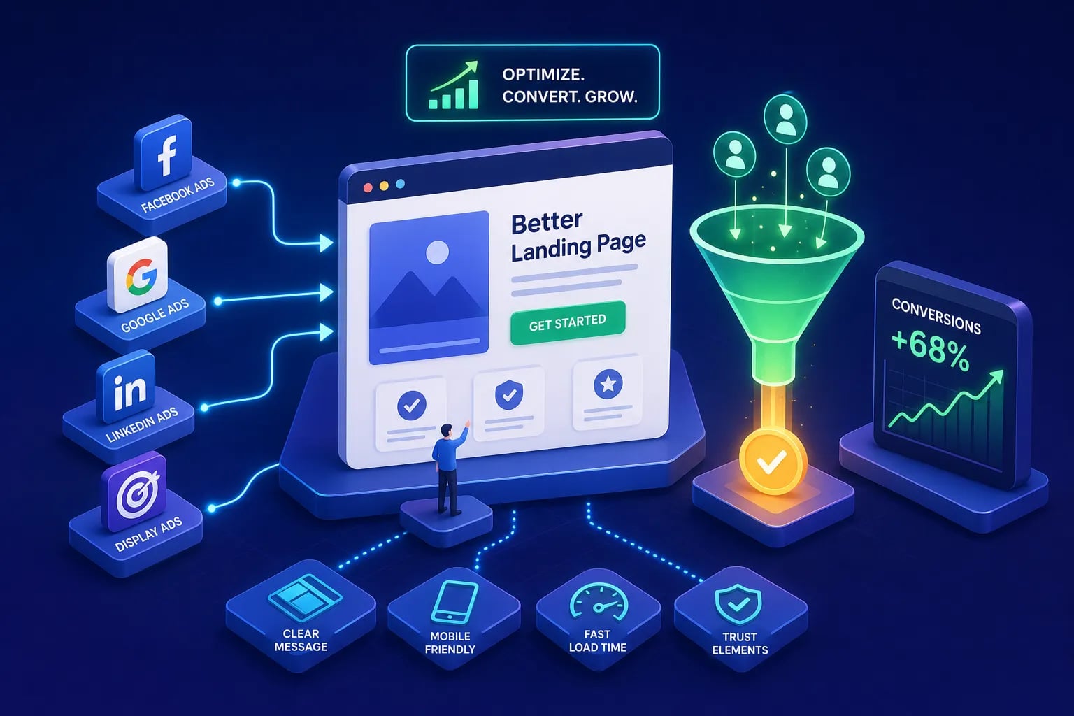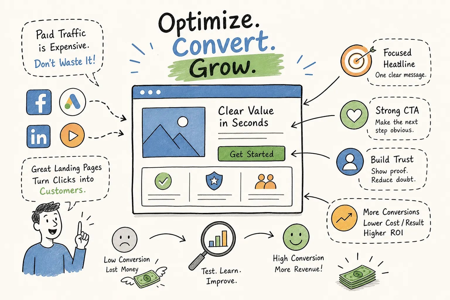
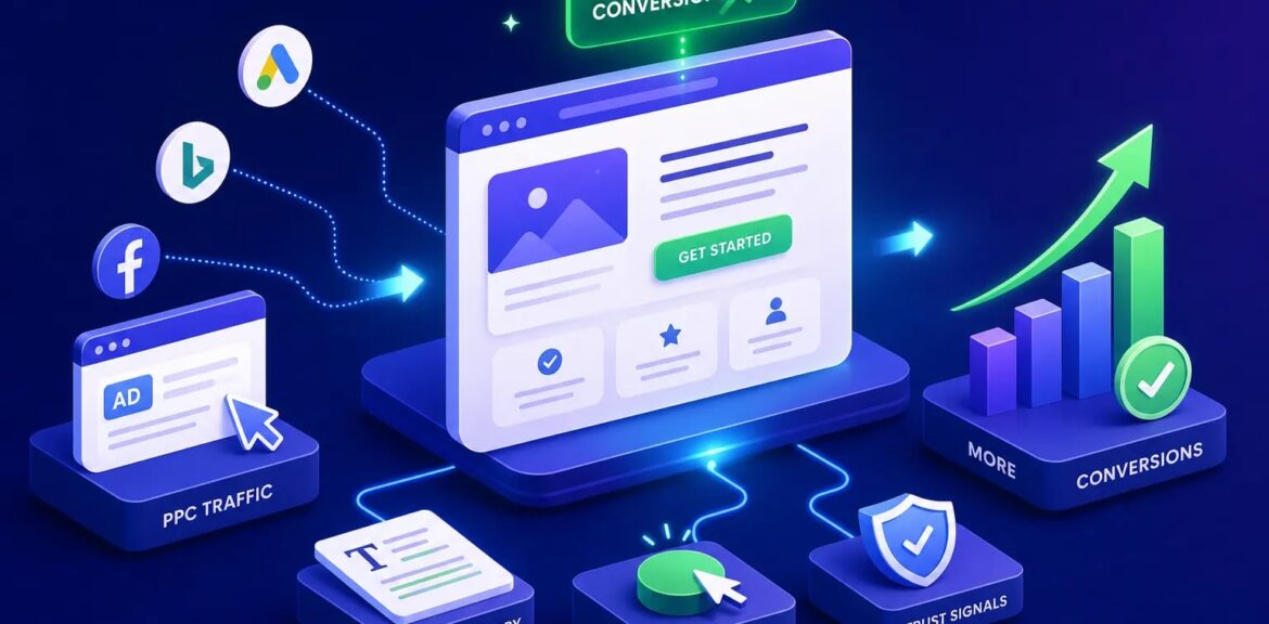

These 12 PPC landing page tips address the most common and costly failure points between your ad click and your conversion. Start here: the cross-industry median conversion rate for paid landing pages sits at 6.6%, while most ecommerce pages convert between 2.35% and 4.2%. That gap often reflects post-click landing page experience rather than traffic quality alone, though offer type, device mix, and audience intent also play a role. Fix the page, and you fix the gap.
A meaningful portion of wasted ad spend stems from poor landing page experience. Your bidding strategy earns the click, but the page has to close it. Improving the post-click experience is where the fastest ROAS gains live, and it’s where most advertisers leave the most money on the table. At EcomTalkPoint, landing page optimization sits inside every client’s PPC management framework as part of a structured approach to post-click conversion rate optimization (CRO), because even a perfectly structured campaign bleeds budget when the page doesn’t convert.
Below are 12 specific, actionable PPC landing page tips grouped into six areas, from message match to A/B testing basics. Each one is something you can implement or delegate this week.
PPC Landing Page Tips for Message Match: Tips 1, 2, and 3
1. Mirror your ad headline in your landing page H1
When a user clicks an ad that reads “Women’s Running Shoes From $39,” the page H1 must echo that exact promise. This is called ad-to-page relevance, and it’s the single biggest lever you have over whether visitors feel they landed in the right place. Headline and value proposition changes produce the largest average lift in published A/B test datasets, roughly 18 to 35% relative improvement.
A practical example: an ad headline reading “24/7 Emergency Plumber” should lead to a page H1 reading “24/7 Emergency Plumbing in [City]” with a visible phone number above the fold. The visitor’s internal question, “Is this the right page?”, gets answered in under three seconds, and they stay.
2. Carry every specific claim from ad to page
If the ad mentions a free trial, a discount, or same-day delivery, that claim must appear on the page prominently and with accurate terms. Failing this creates a trust gap the visitor usually resolves by leaving. They clicked for a reason; if the page doesn’t confirm that reason, you’ve paid for a bounce.
There’s also a Quality Score dimension here. Google evaluates landing page experience based on ad-to-page relevance, and mismatches can raise your CPCs and lower Ad Rank. Fixing message match improves both your conversion rate and your auction efficiency at the same time.
3. Send each ad group to its own dedicated page
Generic homepages kill specificity. Each tightly themed ad group deserves a page built for that single intent, not a catch-all destination that forces visitors to figure out where to go next. This is the structural difference between a low and a high conversion rate on identical traffic; dedicated pages can materially shift that number. Building them takes more work upfront, but the performance difference compounds over every campaign you run.
Stripping the Distractions That Silently Kill Conversions: Tips 4 and 5
4. Remove your navigation menu completely
Navigation is a conversion leaker. Every menu link is an exit ramp you paid to build, and PPC landing page best practices are consistent on this point: removing full-site navigation typically lifts mid-funnel conversion rates by 20 to 30% relative. A dedicated landing page with no navigation keeps the visitor’s attention focused on the single goal, the conversion action.
This is one of the fastest structural changes to implement, and the lift is usually immediate. If your current PPC traffic is landing on pages with full navigation, this change alone can move your numbers meaningfully before you touch anything else on the page.
5. Commit to one CTA and one conversion goal per page
Multiple CTAs create decision paralysis. When a visitor sees “Buy Now,” “Learn More,” “Watch the Demo,” and “Download the Guide” on the same page, attention splits and all of them suffer. Pick the single most valuable action for that campaign and build every element on the page to support it.
A useful practical rule: if you can’t describe the page’s goal in one sentence, it has too many goals. This applies whether you’re running a lead generation campaign for a local service business or a product page campaign for an ecommerce store. One page, one job.
Placing Social Proof Where It Actually Moves People: Tips 6, 7, and 8
6. Put a specific, attributed testimonial above the fold
“Great service” is not social proof. An attributed quote with a name, photo, company, and a concrete outcome, such as “Reduced our reporting time by six hours a week”, is. Specific testimonials near the top of the page are associated with roughly 30 to 35% conversion lifts in published test data, and the specificity is doing most of that work.
Place your strongest testimonial alongside or directly below the hero headline so visitors encounter proof before they scroll. The goal is to have the visitor think “someone like me already bought this and it worked” within the first few seconds on the page.
7. Show third-party review ratings next to your CTA
A “4.8/5 from 312 reviews” badge pulls at a visitor’s hesitation at the exact moment of commitment. Use verifiable platforms: Google, Trustpilot, G2, or Capterra. An anonymous star rating with no named source won’t carry the same weight, and sophisticated buyers will notice the difference.
For ecommerce, review volume matters significantly, especially for higher-priced products. In practice, increasing review volume, moving from a handful to dozens, shifts conversion behavior noticeably, particularly on higher-ticket items. The number signals that real people bought the product, not just that the seller claims it’s good.
8. Use a mini case study below your core offer
A short before/after structure works well here: problem, solution, quantified result. This format is particularly effective for high-consideration purchases and B2B lead generation, where visitors spend more time evaluating before committing.
A case study snippet matched to the ad audience, say, a home services company reading about a similar contractor’s result, converts better than a generic industry testimonial. The closer the story matches the reader’s situation, the more persuasive it becomes.
Urgency and Trust Signals That Get Hesitant Visitors to Act: Tips 9 and 10
9. Apply honest urgency with deadlines or limited availability
Countdown timers, limited stock callouts, and deadline-based offers work when they’re real. Fake urgency destroys trust the moment a visitor returns and finds the same “48-hour” deal still running. In published split tests, authentic urgency elements have produced 9 to 14% conversion lifts; manipulative urgency is associated with higher refund rates and weaker repeat purchase behavior.
Effective use cases include flash sales, event registration deadlines, seasonal offers, and genuinely limited service slots. Frame urgency around the benefit of acting now, not just the penalty of waiting. “Secure your spot before Friday” outperforms “Offer ends soon” because it tells the visitor exactly what to do and by when.
10. Add guarantees and security badges near the point of risk
The highest-anxiety moment on a landing page is right before form submission or payment. That’s where security badges, money-back guarantees, privacy statements, and cancellation policies belong. Visitors asking “Is this safe?” need an answer before they click Submit, not after.
Place these elements adjacent to the CTA button and the payment or form field. Burying a satisfaction guarantee in the footer means most visitors never see it at the moment it would actually reduce their hesitation. Position trust signals at the point of risk, that’s where they work.
Page Speed and Mobile Experience: Tip 11
11. Target an LCP under 2.5 seconds on mobile
Pages with LCP under two seconds show a 5.7% median conversion rate versus 2.8% for pages taking over five seconds, roughly a 51% relative difference. For most PPC campaigns, the practical mobile target is LCP at or below 2.5 seconds, with under 2 seconds as the performance standard to aim for. Speed also affects landing page experience in Quality Score, which feeds into Ad Rank and CPC. Slow pages both reduce conversions and can worsen landing page experience scores, which may indirectly raise CPCs, measure both conversion rate and Quality Score signals when testing speed improvements.
Ecommerce and local service campaigns send significant mobile traffic. A form built for desktop, one that requires pinching, zooming, and precise tapping, quietly destroys your mobile conversion rate. Reduce form fields to the minimum viable set: shortening an 11-field form to four fields has been reported to increase conversions by up to 120% in published test data. Use large tap targets, autofill-friendly fields, and numeric keyboards for phone number inputs. These aren’t minor polish items; they’re direct revenue levers for mobile-heavy campaigns.
Running a Simple A/B Test to Keep Improving: Tip 12
12. Test headlines first, then form length, then CTA copy
Headline testing consistently produces the largest average gain across published A/B test datasets, so start here because the upside is highest and the test is cleanest. Run a controlled split with one variable changed, measure until you reach statistical significance, and confirm a winner before moving on. After confirming a headline winner, move to form length. Removing unnecessary fields reduces friction at the moment of conversion, where hesitation is highest.
CTA copy and button placement are the next tier. Specific, outcome-language CTAs such as “Get My Free Quote” or “Start My 14-Day Trial” outperform generic ones like “Submit” or “Click Here” reliably. The reasoning is simple: outcome-language tells the visitor exactly what they’re getting, which reduces the uncertainty that stops people from clicking.
How EcomTalkPoint Applies These Principles in Practice
These 12 tips aren’t a checklist you run once and archive. They form a continuous optimization loop: match the message, remove friction, build trust, test, repeat. Each layer compounds the one before it, and accounts that prioritize this process consistently outperform those that treat landing pages as an afterthought.
EcomTalkPoint’s landing page optimization service applies exactly this framework as part of a broader PPC management process. Every client engagement includes auditing the post-click experience alongside campaign structure, bidding strategy, and conversion tracking setup, so the entire funnel is held to the same performance standard as the campaigns driving it.
Start with the Foundation, Then Compound the Gains
Your ad creative and bidding strategy can only do so much. If the landing page breaks the promise the ad made, you’re paying for clicks that will never convert. The 12 PPC landing page tips above address the most common and most costly failure points in that post-click experience.
For prioritization: start with message match (tips 1 through 3), then strip distractions (tips 4 and 5), then layer in social proof (tips 6 through 8). Urgency, speed, and systematic A/B testing compound the gains from that foundation. Don’t try to fix everything at once. Pick two tips from this list, implement them on your highest-spend campaign’s landing page this week, and measure conversion rate change once you have a statistically meaningful sample. A testing tool or significance calculator can help you determine when you have enough data to call a winner. Small, focused improvements to your paid landing pages compound faster than most advertisers expect.
If you’d rather have an expert audit your current pages as part of a full PPC review, EcomTalkPoint’s team does exactly that. Reach out to discuss what a structured landing page and campaign audit looks like for your business.